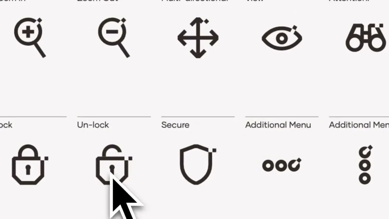
Icons at UM6P are essential components of our visual identity.
Icons embody simplicity, precision, and usability—mirroring the architectural harmony and geometric rhythm of our campus and design system.
Our icons follow a unified graphic language:
Grid-based construction ensures visual balance and scalability
Stroke-weight consistency reinforces clarity and cohesion
Minimalist design keeps them legible at small sizes and across platforms
Icons contribute to a clean, engaging, and intelligent communication experience.
They work best when used intentionally to reinforce key concepts, guide actions, or structure complex information visually.
Don'ts:
Don’t over-decorate or illustrate unnecessarily
Don’t distort, rotate, or recolor icons
Don’t mix icon styles within one interface or layout
Use icons when they support:
Navigation: menus, tabs, CTAs
Instructional flow: steps, procedures
Category tags: thematic sections
Infographics: complementing data
Highlighting features: services, values, tools
All UM6P icons should be sourced from the approved icon library.
If new icons are needed, they must follow the same design system and be validated by the brand team.
Icons are not decoration—they are design logic made visible.
download icons
Yes, you may create your own custom icons, provided they align with the overall visual identity and brand guidelines. However, we strongly recommend submitting your designs to the design studio for review and approval to ensure consistency and proper integration.

it is recomended to use the UM6P icons. If needed you can use other flat icones that might be similar our pack just for brochures and booklets. For key visuals and banner. It is mandatory to use the UM6P icons

Avoid

Avoid

Avoid