Our primary colours palette has been specifically selected for its relationship to the architecture of the UM6P campus.
UM6P Primary Orange
Pantone 173
C 11, M 86, Y 97, K 01
R 215, G 73, B 42
#D7492A
UM6P Light Orange
Pantone 1645
C 00, M 68, Y 73, K 00
R 237, G 110, B 71
#ed6e47
UM6P Charcoal Black
Pantone 440
C 00, M 00, Y 00, K 92
R 59, G 59, B 60
#3b3b3c
UM6P White
Pantone —
C 00, M 00, Y 00, K 00
R 255, G 255, B 255
#ffffff
Orange
On White
Secondary Text on black would be
perfect for your design !
Numbers on UM6P Primary Orange
01
White
On Orange
Secondary Text on White would be
perfect for your design !
Numbers on UM6P Light Orange
02
Dark Grey On Light Orange
Secondary Text on Dark Grey would be
perfect for your design !
Numbers on UM6P Primary Orange
03
Science & Technology
Dark Blue
Pantone 2728 C CMYK (approximate for print): C: 90% M: 79% Y: 0% K: 34%
hex: #1125A9
light Blue
Pantone 2727 C CMYK (approximate for print): C: 59% M: 38% Y: 0% K: 15%
hex: #5987DA
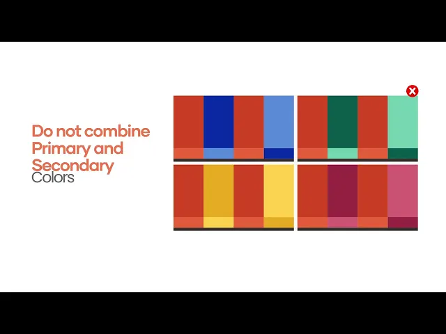
If the banner or visual is institutional, using different shades is not permitted. However, for other elements within the ecosystem, variations in shades may be allowed. This applies strictly to the visual components, not the logo.
flashy colors. And colors that doesn’t give enough contrasts in order to keep the key elements visible (like texts, logos…)
neon pink
neon yellow
neon blue
neon green
neon purple
yes, just ensure a good contrasts in order to keep the key elements visible
The logo must always appear in monochrome:
White when on dark backgrounds
UM6P Dark Grey when on light backgrounds
Do not apply gradients, patterns, or effects to the logo.
Always ensure maximum visibility and clarity. Maintain clear space around the logotype.
Text should always appear in White or UM6P Dark Grey, depending on the background.
Use White text on dark backgrounds
Use Dark Grey text on light or soft backgrounds
Avoid using brand orange or accent tones for large bodies of text. Always prioritize legibility and contrast.

UM6P’s palette is inspired by the geometry and architectural logic of the campus.
It expresses boldness, clarity, and openness.
Primary Palette:
UM6P Orange – Energy, movement, and progress
UM6P Black – Strength, authority, and precision
UM6P White – Openness and balance
Light Orange / Peach – Soft warmth for backgrounds
Grey scales – For subtle hierarchy and content segmentation
The gradient must comply with the UM6P graphic charter.
Avoid over-saturation or unauthorized tones.
FAQ / Tips
Can I invent a new color?
✗ No. Always use the approved palette. Exceptionally, custom tones may be developed in collaboration with the brand team.
My text isn’t very readable—what should I do?
Can I mix six different colors?
Can I put yellow text on a white background?
I'm designing a poster related to health for example — which color should I use?
Can I use orange for body text?
Is black always acceptable for text?
What if the background is an image?